Motice: Imagine tomorrow’s financial UX
01.2021 - 02.2021/ 4-week group project
Group member: Dongheng Wu/Jakob Kohnel/ Yanyi Lu/Yuchen Lan
Keywords:
Sound design, user experience
Review from UXDA
The design for Motice is playful and intuitive. It is also provocative in its solution to a very relevant problem space. Its multimodal design approach demonstrates great interdisciplinary collaboration and a good grasp of inventive UX. The subtle yet impactful concept with extensible elements was created in an accelerated timeframe. The design process and user considerations helped address initial accessibility and privacy concerns, making this concept a solid award winner in the New Talent category.
--Amber Lundy
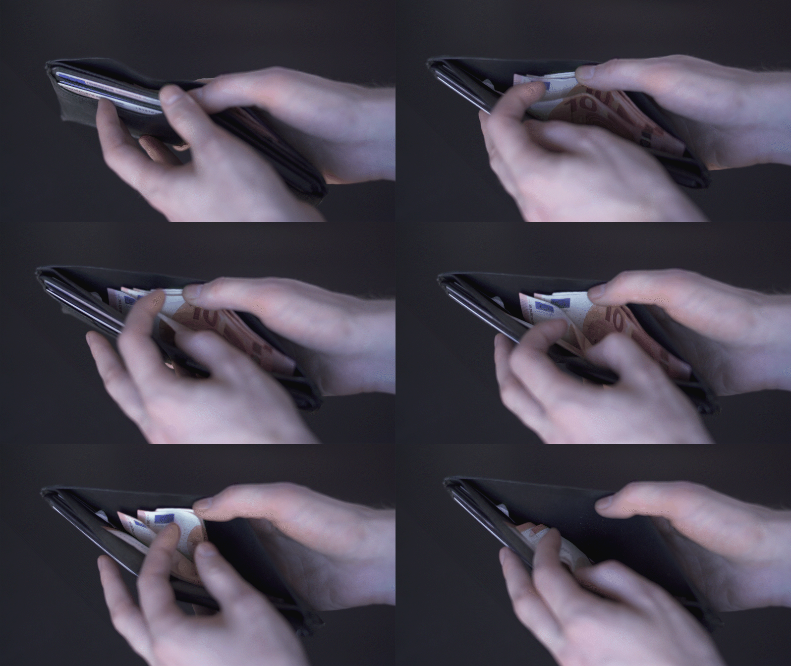
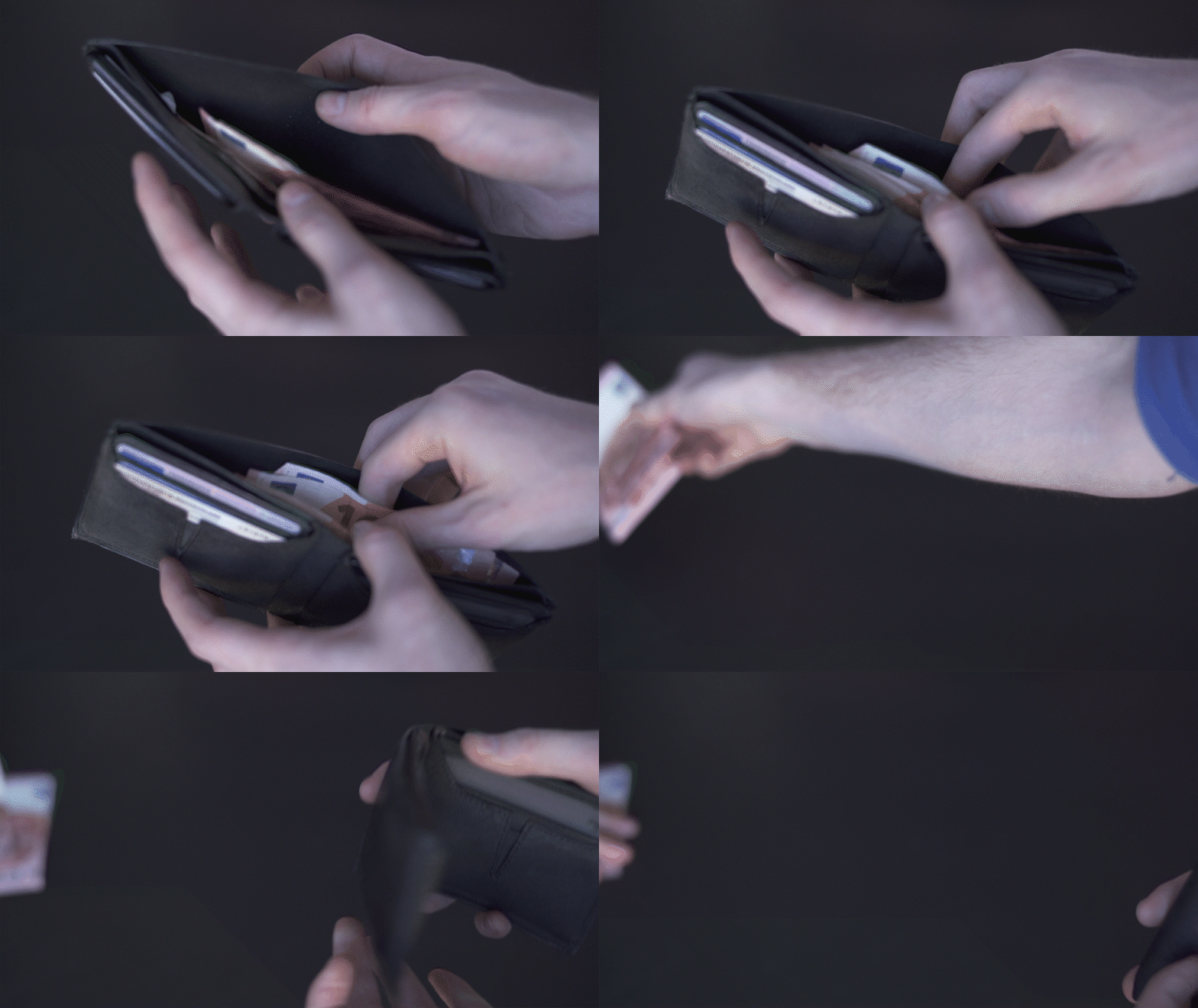
Physical money vs. Digital money
Nowadays, the cash-based society is gradually changing to a digital currency-based society. Financial technology provides people with various payment methods such as NFC/QR code payment by phone. Digital currency experience brings convenience, but also more or less affects people's rational consumption. It's easier to lose the tracking and feeling of spending and remaining when paying by digital money than cash
Physical money
Physical money makes it easy for people to keep track of their money. But today, with the rapid development of digitalization, physical money is being phased out because of their lack of convenience.
Digital money
Digital currency brings convenience but also affects people's financial experience. It's easier to lose the track of spending and remaining when using digital money than cash.
Problem: Digital money doesn’t feel real!
Due to the development of electronic money, people are becoming less and less sensitive to money. All people can see is the change in numbers, and this change lacks comparison, especially for credit cards, which can easily make people overspend and lose track of their money.
Can we bring the tangible feeling back to the digital society ?
Analysis: How does physical money provide a tangible sense?
Tangible Form ➔ Sensory Intuitiveness
We can directly see the amount of physical money, feel its weight, and even hear the sound of coins or paper.
Comparisons ➔ Magnified Money Flow
We can feel the physical money is losing from wallet. Compared to the state before payment, we can also notice the wallet become lighter and flatter
Solution: Motice
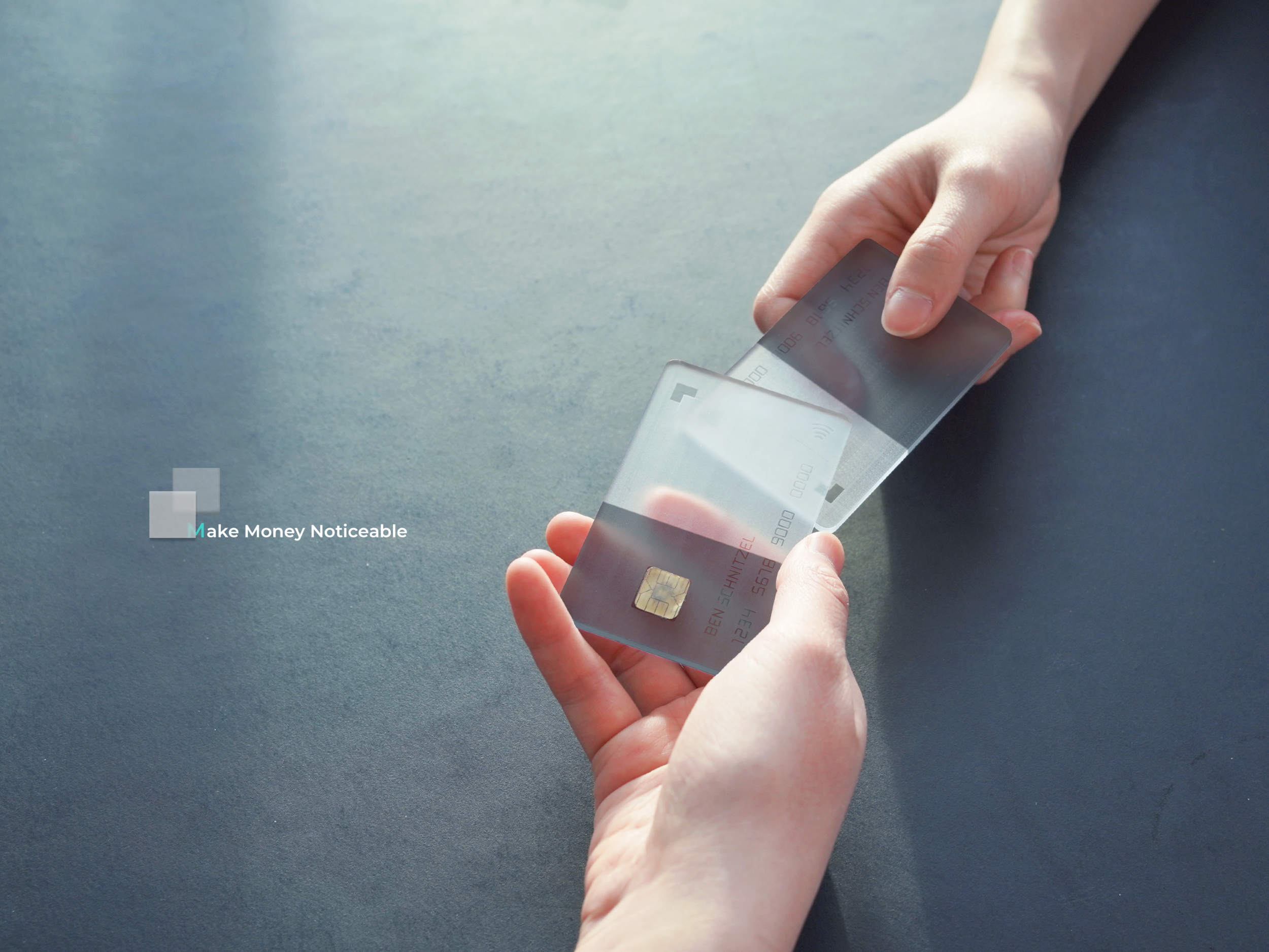
'Motice' aims to make digital money more noticeable to people who want to track money conveniently, to parents who want to teach children how to use the money correctly, and to elders who struggle with digital payment. A card system is designed to provide people a transparent and private experience of using digital money.
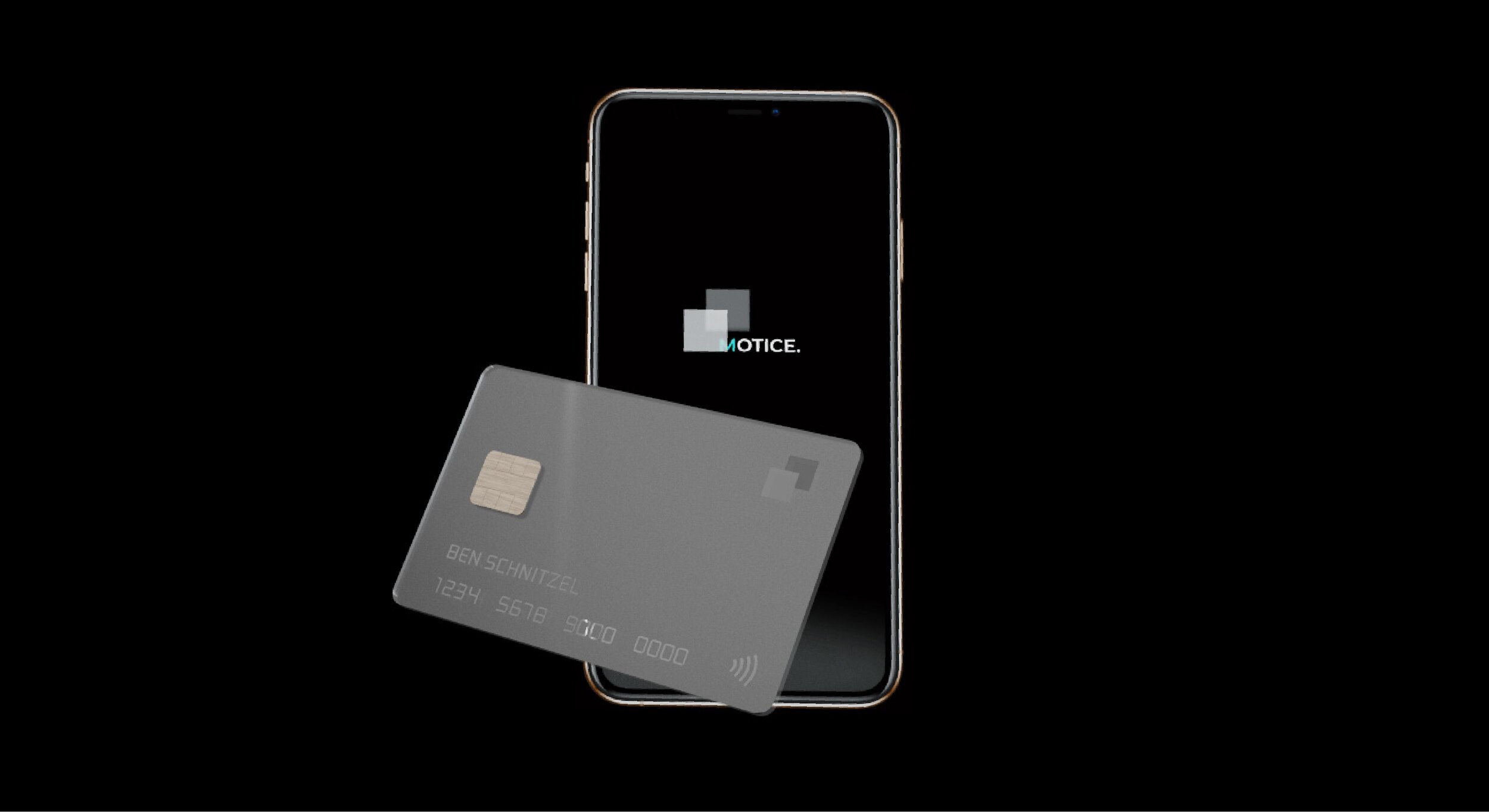
A card system with an APP
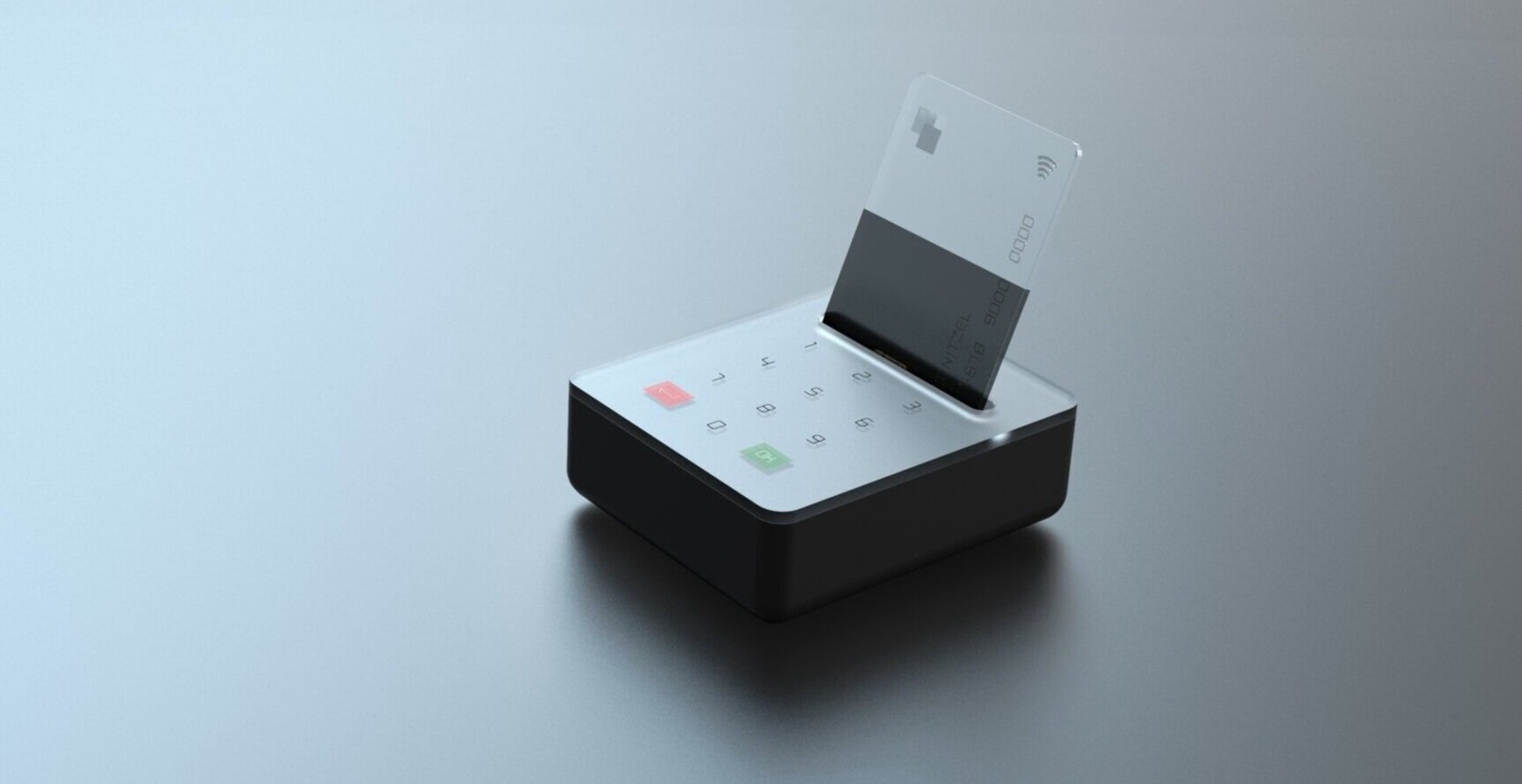
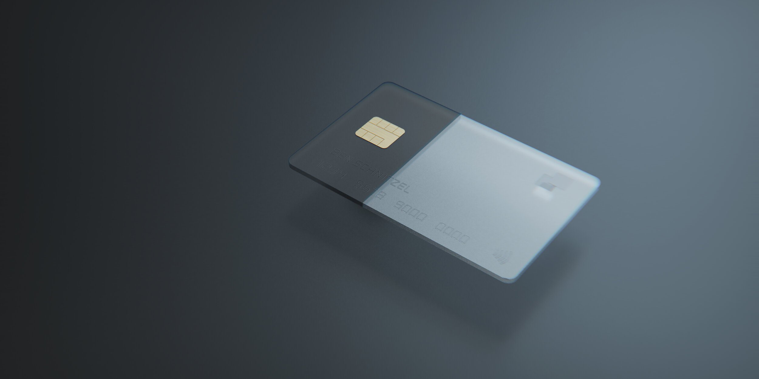
A card system is designed to provide people with a transparent and private experience of managing digital money. 'Motice' provides options for users to choose to use physical cards or virtual cards depending on their needs or habits. It is inclusive for different users and diverse situations. Users can manage multiple cards in one account on App.
Perceive your budget before and after payment by listening to the sound!
Feel the actual money flow through the visual changes of the cards and terminals!
GIF demo
How does the APP work?
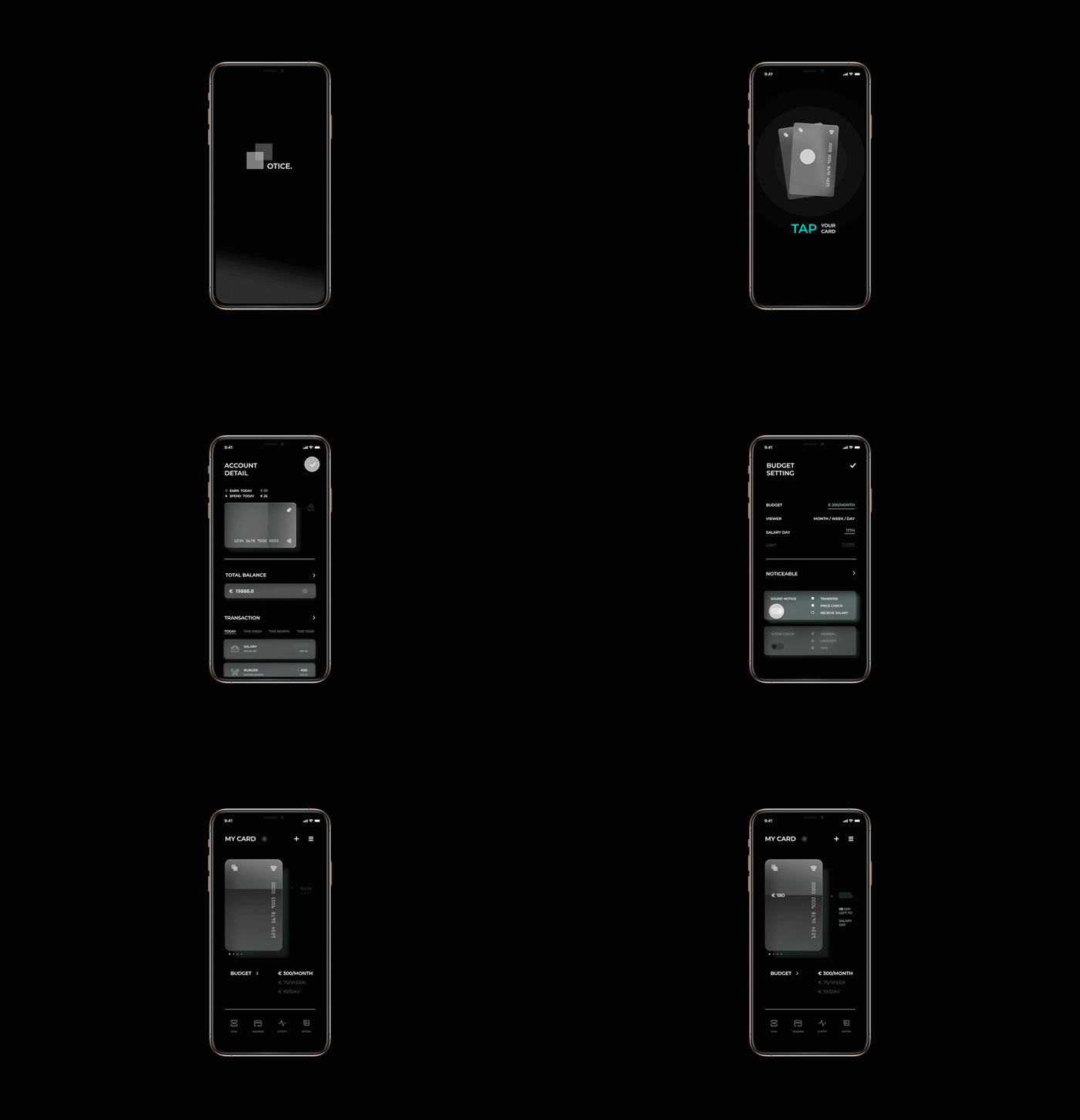
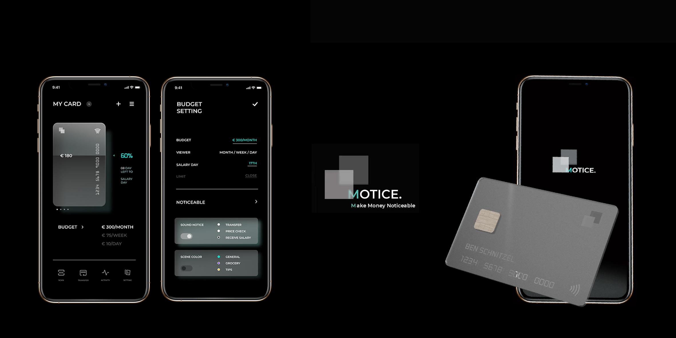
Budget and notification setting: In the App, users can customize the budget and set different levels of notification. Because only users know the meaning of setting, the visual and sound of budget change will not leak the privacy. The card has an interactive ink screen that supports checking and know the statuses of the budget on the card directly without opening the App.
Privacy: all the notifications only make sense to you!
Since the budget settings are customized, all the sounds, as well as the visual presentation, are just a comparison of your settings, so others cannot get your private information from these notifications.
Bringing tangible feeling to digital money in a playful way, while protecting your privacy, that's Motice!
Last project: Ceia
Next project: Elepsy


